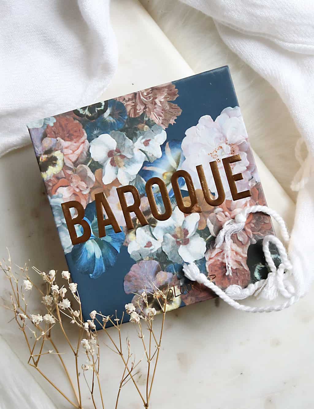
Is the Colourpop Baroque Palette the Perfect Grey Palette?
The Colourpop Baroque Palette isn’t something I would normally gravitate towards, and yet it caught my eye.
With one of the Pantone colours of the year for 2021 being Ultimate Grey, I’m expecting to see plenty of the shade going forward. Cooler tones have been making a comeback in makeup but grey can be tricky when it comes to formulation. Often they end up dusty, poorly pigmented or don’t wear well.

When I saw the Colourpop Baroque Palette there was just something that spoke to me. The spectrum of pale matte grey, true navy, sparkling charcoal and blue brown duochromes easily filled voids in my collection and creates a palette that stands apart from the constant warm neutrals we see over and over again.
Basically, I had to have it.
Could it be the perfect grey palette?

colourpop baroque palette review & swatches
AVAILABLE AT: COLOURPOP.COM

“If it ain’t Baroque…. This rich gunmetal and navy blue palette is our moody vibe. Cool metals and icy greys in a range of matte and metallic finishes create the perfect palette for your look.” – Colourpop

let me tell you a little story about grey…
You see, many many years ago, I found the perfect pale dove grey eyeshadow. It was called Early Morning, from MAC and was in their much underrated matte² formula. It was sadly limited edition and in 15+ years they have never brought it back because clearly, they have a vendetta against me.
Since then, I’ve searched high and low with little luck. And then I saw the pale matte grey in the Colourpop Baroque Palette and I knew I needed to see if it was a match… you know, for science. I’ll give you a spoiler here and say the undertone of it is PERFECT, however it is a bit lighter than the original, and the formula is nowhere near the buttery texture I had hoped. It’s good, but not great.
But how do the rest of the shadows and the palette perform overall?
is it blue? is it grey? is it plum? is it brown?
The answer, my friend, is YES. This palette is all those things and more.
Something I have learned about Colourpop is that the way they think out their palettes is incredibly smart; They make most of their palettes both intuitive and also inspiring. They want to give you easy as well as unique, which means some interesting colour combinations.
The Baroque Palette might seem quite blue on first glance, but it’s actually incredibly diverse with hints of plum and copper. There is also a multitude of finishes including flat matte, sequin (this is a matte base with micro sparkle), metallic and duochrome. (and no, there is no pressed glitter!)
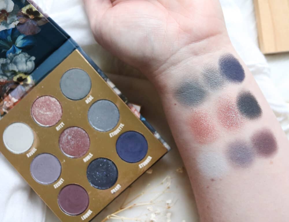
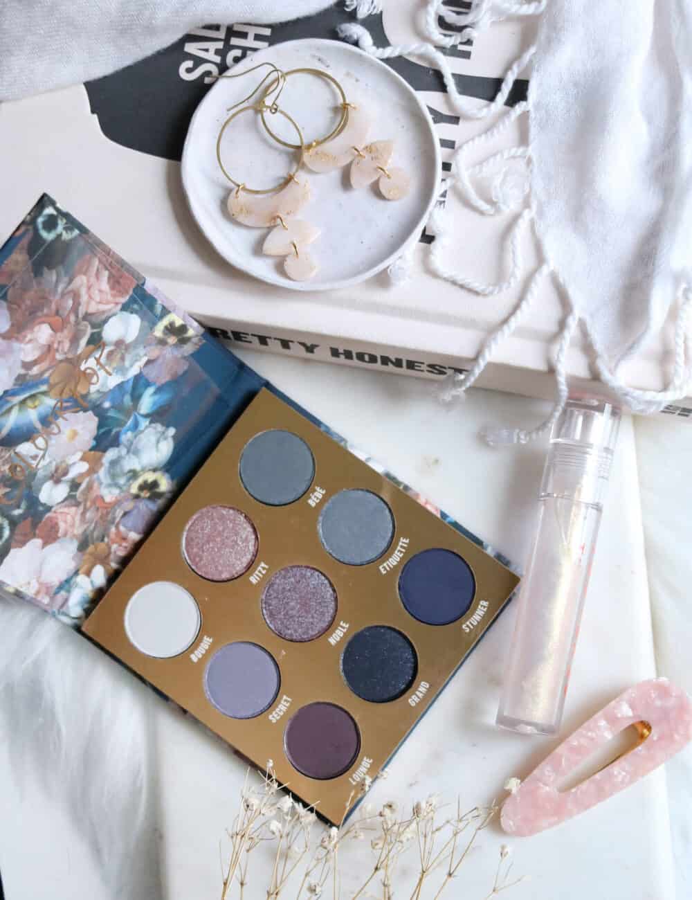
colourpop baroque palette shade breakdown
- BOUGIE – pale matte dove grey
- RITSY – taupe blue duochrome
- BEBE – matte warm blue based grey
- SECRET – matte plum grey with blue micro sparkle
- NOBLE – blue brown duochrome
- ETIQUETTE – light charcoal with silver shimmer
- LOUNGE – matte muted plum
- GRAND – matte blue black packed with silver purple and blue micro sparkle
- STUNNER – a true matte deep navy

formula is everything
Colourpop is known for having really affordable pricing, but the formula can be hit or miss for me when it comes to the matte shades especially.
While these are definitely a drier formula in the matte shadows, they do have pigment as you will see in my swatch video. The key with these is to use a base that has a bit of grip over a silky, silicone feeling one; Something like MAC Extend Eyebase works great for holding the pigment.
Sometimes a dry or dusty formula can blend away on the eyes and cause a lot of fall out. This sometimes happens with Colourpop matte shadows, and the key for me is to pat or pack the colour on, then blend out, rather than going straight in with a fluffier blending brush.
The duochromes are actually not as metallic as I had hoped, knowing how good Colourpop’s formula can be. They apply best with a brush and buffed in to reveal more of the duochrome look, in my experience. Personally, I didn’t buy the palette for those shades, but if you are it’s worth taking note.
There are definitely a few standout shades
- BOUGIE is a pale matte grey that this palette really needed
- BEBE is a rich warm grey that isn’t something I find often
- GRAND is STUNNING as a smokey eye with loads of tiny micro sparkle
- STUNNER is true matte deep navy that is shockingly hard to find in my experience
so is COLOURPOP BAROQUE perfect grey eyeshadow palette?
…no.
It’s good. It’s just not amazing.
There is definitely room for improvement here, and I find that often with Colourpop palettes. The brand gets insanely hyped over on Instagram because they have a massive influencer sendout media list and Instagram is the world of pretty swatches but not much substance.
Pretty swatches only tell 50% of the story, and that is to show the colour…they don’t tell you how much building it took to get true to pan colour, or what the formula is like on the eyes. More so, they don’t tell you how the shadows perform with a brush – something most of us use to apply powder eyeshadow.
I’m glad I bought this palette purely for the few shades I know I will get a lot of wear out of. It’s just one of those eye shadow formulas that takes some strategy when it comes to application, which doesn’t make it a bad formula by any means.
do you have a favourite colourpop palette?